Thursday, April 19, 2012

The Process of Illumination


The Process of Illumination
acrylic/pencil on canvas, 20 x 24"
$150.00

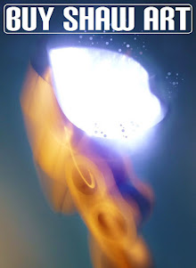
I already spoke about The Process of Illumination back in March, but mentioning it in regard to it's exposed pencil lines in my last post on Polar, I wanted to share some more pictures of this minimalist canvasAs I did with Polar, the pencil lines of the initial drawing were left visible on the canvas, then smoothed over with my fingers, leaving the smudge marks around them for a worn looking surface on the canvas. When I felt the number of washes in varying shades if white had reached the desired effect, I went back over my initial pencil drawing, then varnished over the canvas to finish.


As I said before, the inspiration for this canvas was that synapse at the moment of sentient understanding we experience when we become aware of a situation, concept, or inner realization. Illustrating raw, base emotion in my work had become the foundation of my work, but an undefined existentialist idea such as this was new territory for me. The spare pencil lines connecting there at the horizontal row of circles in the middle ground illustrate that point awareness, that connection. I had to resist not strong handling the the canvas to keep it's gauzy nature, and hence it's interior essence, intact. It looks simple enough, but in my recent experiences working within a nonobjective style, expressing such an open idea can be difficult. That said, if these paintings have not been successful in the eyes of my public, the last year of work has been a time of real growth in my creative process. For these reasons, I feel The Process of Illumination is a work of personal triumph.

See more of my available works at my WORKS AVAILABLE page at Shawart.com :)  EMAIL ME if you are interested!

Tuesday, April 17, 2012

Polar

"Polar" 2011
acrylic, pencil on canvas, 36 x 48"
$275.00

Like the rest of my canvases for the recent Dueling Minds show, Polar could not have been more removed from anything I've recently done, in both scale and nomenclature. Most of it was painted in very thin layers of wash- first light blue, then metallic gold within the penciled circles swirling out from the two larger intersecting discs, and then several more washes in iridescent white around the gold discs. This was done gradually while working on the other canvases for the show, and was the last to be completed, going back over the circles in pencil, then varnishing to finish. I've left the pencil lines visible in some of these canvases (as such with The Process of Illumination), even smoothing them over with my fingers, leaving the smudge marks around them for a worn looking surface on the canvas.

The Polar title was my suggestion, stemming from my show partner Dale's opposites attract idea in our initial discussions for shared titles. The iridescent paint give this canvas a ethereal or celestial quality, like some astral coupling of two souls. It projects a hushed peace, the smaller gold spindrift radiating outward from the central converging bodies. For a lack of better words it's... well, pretty, changing it's appearance from different viewing angles and times of the day.

po·lar (poh-ler) adjective
1.  of or pertaining to the North or South Pole.
2. of or pertaining to the pole of any sphere, a magnet, an electric cell, etc.
3. opposite in character or action: The two have personalities that are polar.
4. capable of ionizing, as NaCl, HCl, or NaOH; electrolytic; heteropolar.
5. central; pivotal: the polar provision of the treaty.
(dictionary.com)

See more of my available works at my WORKS AVAILABLE page at Shawart.com :) EMAIL ME if you are interested!

Monday, April 16, 2012

Interview on The Bill & Frantz Show

I had a great time sitting in with the guys on The Bill & Frantz Show this past Saturday afternoon! Among the topics of the day were:  Bud Lite Lime vs. Miller Chill Lime, Arizona's new abortion law, California's recent Supreme Court ruling on the lunch break law, and my art! Concerning the latter, we discussed my recent Dueling Minds show at Concrete Ocean, as well as a couple canvases from past years- Enjoy  :)


A better look at Lover's Eden & Diver below, both of which are still available for purchase:

“Lover's Eden”, 2008
acrylic & charcoal on canvas, 12 x 16”
$75.00


"Diver" 2010
mixed media collage on canvas, 11 x 14"
$40.00

See more of my available works at my WORKS AVAILABLE page at Shawart.com :)  EMAIL ME if you are interested!

Tuesday, April 10, 2012

Embrace

"Embrace" 2012
acrylic on canvas, 20 x 24"
$150.00

Part of the challenge preparing work for the recent Dueling Minds show at Concrete Ocean was stepping outside my comfort zone and working in a completely nonobjective manner, something I'd only dabbled in before. Given a title and size to work with, what could I say about the subject without a figure, landscape, or object with which to tie a narrative or story to?

Several of my canvases had already been washed in color and basic compositions put into place before I'd assigned titles, and looking down the list "Embrace" seemed to fit the iridescent, gold warmth of this canvas. Denying myself the usual anecdotal machinations of my work, where to begin was the trial, and looking around the studio for anything to spark my imagination I noticed a cymbal from my drumset leaning in a dusty corner. Laying it on the 20 x 24" canvas, I was amused & delighted to see it fit perfectly- it wedged into the sides in a most pleasing way, pushing itself forward into picture plane. I went on to use this unusual stencil on a few of my canvases for the show, penciling the shape onto the washed canvas, and then embellishing around, inside, and over the top of the circle in many layers of  acrylic.

See more of my available works at my WORKS AVAILABLE page at Shawart.com :)    email me if you are interested!

Sunday, April 8, 2012

Shady Lady

"Shady Lady"
acrylic & charcoal on canvas, 24 x 36"
$225.00

I think it's fair to say most of the canvases I painted for the recent Dueling Minds show at Concrete Ocean were far removed from anything I'd done before, eschewing my "modern folk art", as Dale defined it, for a completely nonobjective approach. While many of the narrative/story paintings I've been making for years could be described as abstract, the simple figures, animals, and symbols that fill them are representative by nature, so they aren't "pure" in that way.


After some warming up on a few paintings like "Mecha Verde", I started work on the first canvas that would be part of Dale's and my concept portion of the Dueling Minds show. "Shady Lady" was Dale's first title idea, so I just ran with it. This one began with heavy charcoal, stabilized by brushing matte medium over the drawing, as I sometimes do nowadays, leaving the canvas a splendid, sooty mess. Several layers of dark magenta were then applied, further stabilizing the fugitive charcoal and unifying the surface of the canvas in both texture and color, care taken not to completely mask the smeared drawing beneath.  Like "Mecha Verde", it prompted several biological associations, from myself included, when upon it's completion I observed it's likeness to a cephalopod (well, look at it!). It's simultaneously menacing and whimsical, like some sort of villainous Disney creature, and was a favorite at the show.

See more of my available works at my WORKS AVAILABLE page at Shawart.com :)  email me if you are interested!

Friday, April 6, 2012

Mecha Verde

"Mecha Verde" 2011
acrylic on canvas, 16 x 20" each
$225.00 for the pair

In addition to the collaborative portion of our Dueling Minds show this past month at Concrete Ocean, Dale Wilke and I filled the adjacent space with our own individual works. These two small canvases, "Mecha Verde" were part of my offering. I began painting these in my apartment during a very hot June of 2011, flexing my non-objective creativity in preparation for the collaborative work work to come. In progressive layers I began to lay different shades of green, cutting away shapes with even more values, first lighter then darker, until a flow of movement pleasing to my eye was achieved. Interconnecting lines in dark viridian brushstrokes over these pale fern tones, then back under with lighter seafoam threads, a semblance of some sort of bio-mechanical map began to reveal itself.


From there, the wired, whitish-green pods and dotted ranks of peas seem to align themselves, prompting associations with cellular anatomy and amoebic biology from many viewers. I had began affectionately referring to them as Mecha Verde early in development, and upon discovering this was rough Spanish equivalent to green fuse, the name stuck. These have no metaphor or deep underlying meaning, though I seem to gravitate toward green in the warmer months, and so the humid St. Louis summer I was jogging through every morning that summer may have turned me on to this lush chroma.
  

As an artist I find use for all color, and while choosing a favorite would be impossible, I do harbor a strong passion for green. Green has now long been a buzzword for the environmental community, spurring the almost thoughtless slapping of an Eco or green label on anything manufacturers or marketing strategists think of. I was being funny when I told my brother a few years ago that "green is the new black", but I wasn't joking. I guess heightened public and community awareness is a good thing though, even if corporate America has greedily jumped on the bandwagon with another kind of green on their minds.


Green always seems to find it's way into fashion and product trend it seems, and so I was delighted when a guest at our recent show enthusiastically shoved the March edition of House Beautiful into my hands, proclaiming Dale & I "up-to-the-minute fashionable" as we stood in front of one of our collaborative groupings sporting the trendy hue. What can we say? We're with it, Man  :D  That was really fun! 


See more of my available works at my WORKS AVAILABLE page at Shawart.com :)
email me if you are interested!