Friday, December 21, 2012

The Proposal

"The Proposal" 2012
11 x 14"
acrylic, colored pencil, mixed media collage on masonite

Sunday, September 9, 2012

Art From The Heart!

"Handle With Care" 2010
acrylic/mixed media on canvas
16 x 20"

You can bid on this piece at the upcoming 3rd Annual Art from the Heart... a wonderful evening of music, wine and art! Friends of Kids with Cancer is devoted to enriching the daily lives of children undergoing treatment for cancer and blood related diseases. "Our mission is to be an advocate for these special kids and provide them and their families with the recreational, educational, and emotional support needed throughout the long hours of chemotherapy illness and isolation." Please join me in support of a cause that is close to my heart:

Thursday, September 27th, 6-9pm.
Mungenast Lexus of St. Louis
13700 Manchester Road
Manchester, MO 63011
314.822.7681

*Support the Friends of Kids with Cancer Art Therapy Program
*See over 70 pieces of professionally framed art celebrated by kids in the Art Therapy Program for Auction
*Feel the emotion expressed by these wonderful young artists
*Taste the fine wine and hearty appetizers
*Hear the beautiful music of the Poor People of Paris
*Bid on the children's art and silent auction items

Register online today!!

Monday, August 27, 2012

Guardian Kal

"Guardian Kal"
14 x 20"
acrylic on 140 lbs. watercolor paper

Here's something I had fun doing-  a portrait of pal of mine dressed as a galactic superhero.  I've felt for awhile that Kal would be an interesting subject, and a month ago I got the idea from a pic of the bearded one peeking through the band on his headphones. It looked as though he were wearing some kind of visor, somehow sparking the thought of our shared enthusiasm for the Guardians of the Galaxy comic by Marvel. I imagine Kal recruited by Peter Quill/Starlord to join the reunited team, using his cool wits and raygun (The Fridge) to help battle the dread Dormammu to the death at the North Pole! Or where our new recruit was "weaned by wolves in Northern Quebec"? So much to work with here, People...

Saturday, August 4, 2012

Gary Passanise

"Gary Passanise"  2012
acrylic on paper, 14 x 20"

Gary is the Director of Painting at Webster University and founding Executive Director at the Santo Foundation, as well as an accomplished artist represented by Bruno David Gallery here in St. Louis. I tried to fit Gary into a setting that emulates the spirit of his art. so I chose The Baffled King  as inspiration, replacing the black figure in the foreground of his abstract painting with Gary himself.

Gary has an up-coming exhibition at Bruno David Gallery "Gary Passanise: Painting", October 19 to November 24, 2012. Go see it.

Wednesday, August 1, 2012

Pygmalion & Galatea

"Pygmalion and Galatea" 2000
acrylic on board, 14 x 11"

Here's a blast from the past- I was using mythology and religion in many of my paintings during this period, sometimes updating the setting and/or using myself and people I know as the characters, rendered in my awkward, cartoon figurative style. I sold a lot of prints of  "Pygmalion and Galatea"  at a little shop called Archetypes on "the Loop" in University City back then. I like to think about all those prints out in the world and who may be looking at them, what they are thinking...  it was a very productive time for me.

In Greek mythology, Pygmalion was a Cypriot sculptor who carved a woman out of ivory. His statue was so fair and realistic that he fell in love with it. When Venus' festival day came, and Pygmalion made offerings at her altar. There, he quietly wished that his ivory sculpture would be changed to a real woman. When he returned home, he kissed his ivory statue and found that its lips felt warm. He kissed it again and Venus had granted Pygmalion's wish.

See more of my available works at my WORKS AVAILABLE page at Shawart.com :) EMAIL ME if you are interested!

Saturday, July 14, 2012

Covering House Benefit

"Leslie"
digital photograph
CM Shaw 2012

My friend Leslie came back from New York for the recent 4th of July holiday, and played a benefit for The Covering House here in St. Louis at The Wine Press. I say I've rarely have seen someone play music with that much soul, though it's possible I am biased. Before the show she stopped in on the Bill & Frantz Show to talk about The Covering House's mission to help girls who have been victims of sexual exploitation and sexual trafficking, and her own recent Daughters of Cambodia album project addressing the enslavement and forced prostitution of women and children in Cambodia and around the the world. Leslie is one of the finest examples of a human being I know, and we had a ball while she was home.


There was a nice crowd gathered at The Wine Press to raise money for The Covering House, and Rebecca Ryan sang with Leslie on several numbers. It was nice to see them so pretty & happy in the setting light of the windows, and hear the reunited friends sing in an intimate setting like that.

"Leslie with Rebecca (lights)"
Digital Photograph
CM Shaw, 2012


"Leslie with Rebecca (triptych)"
Digital Photograph
CM Shaw, 2012

 
"Leslie (half full)"
digital photograph
CM Shaw 2012

I liked finding our musical friend, Bill Deschand in the background. Bill & Leslie had a band called So Say We All awhile back, and like myself & many of us who have had musical projects with Leslie, Bill is inspired by her great spirit & generosity in performance.

"Leslie (with Bill)"
digital photograph
CM Shaw 2012

Monday, May 14, 2012

Fire In the Sky

Fire In the Sky, 2011
acrylic on canvas, 24 x 30"
$175.00

This canvas was one of the first I made for the recent Dueling Minds show with Dale Wilke at Concrete Ocean. Not meant to be part of the concept portion of the show in which Dale and I worked from the same painting title, it was an initial exercise for my forthcoming switch to a non-objective style I would appropriate for the show. Until this point I had only dabbled in abstract work, and I needed a period of "warming up" before taking on the larger body of work to come.

Unsure of where to begin, I brushed large strokes of bright yellow to begin, returning to accentuate the variations where they had dried in an earthy yellow oxide, letting the canvas direct me as it evolved. Orange acrylic was then used in the foreground, after which I returned to the bright yellow and yellow oxide to knock some of the shapes back in. The dancing color reminds me of an ancient cave painting or Native American tribal art- a fitting comparison, the genesis of that new group of paintings born here during a very hot summer of 2011. In the solitude of my upstairs apartment, the wheels of creativity were turning, and I was... evolving. 

See more of my available works at my WORKS AVAILABLE page at Shawart.com :)   EMAIL ME if you are interested!

Friday, May 4, 2012

Smoke & Mirrors

"Smoke & Mirrors" 2012
acrylic on canvas, 20 x 24"
$150.00

"Smoke & Mirrors" was my show partner Dale's title idea for our recent Dueling Minds show. It was great fun when he would be the one to assign a title, taking me back to my days in art school when SHOE would give us a title assignment in art class- I'd skip off afterward, sketchbook in hand and head full of ideas!

Like several of the pieces for the show, I used metallic paint on this canvas, first brushing thick washes of dark silver, letting the strokes dry fully visible. After additional thinned washes of silver were applied and allowed to dry, I mixed a metallic purple glaze to layer over the canvas, going back to knock the brushstrokes back in with dark silver again. Metallic crimson was then splattered over it all, along with more metallic purple. The result is a softly shimmering surface, a singular orb looking out from the canvas at the viewer from behind the weaved brushstrokes. Like an eye watching from some concealed vantage point, the viewer is fully exposed to the orb, who's full presence, nor design, can be determined.

I think Dale's thought process in reference to the idea this title encompassed was something along the lines of the hazy intent we sometimes encounter among the individuals we encounter in life, whether it be a lover, friend or acquaintance, or even the politicians and corporations that run our country. Those mixed signals can be the product of insecurity, or sometimes dubious machinations- while faith in others is tantamount to earning their trust, it's also important to listen to your instincts. By nature, humans are prone to selfish inclinations, bad decisions,  and irrationality, but I still believe that most people are basically good at heart.

See more of my available works at my WORKS AVAILABLE page at Shawart.com :)   EMAIL ME if you are interested!

Thursday, April 19, 2012

The Process of Illumination


The Process of Illumination
acrylic/pencil on canvas, 20 x 24"
$150.00

I already spoke about The Process of Illumination back in March, but mentioning it in regard to it's exposed pencil lines in my last post on Polar, I wanted to share some more pictures of this minimalist canvasAs I did with Polar, the pencil lines of the initial drawing were left visible on the canvas, then smoothed over with my fingers, leaving the smudge marks around them for a worn looking surface on the canvas. When I felt the number of washes in varying shades if white had reached the desired effect, I went back over my initial pencil drawing, then varnished over the canvas to finish.


As I said before, the inspiration for this canvas was that synapse at the moment of sentient understanding we experience when we become aware of a situation, concept, or inner realization. Illustrating raw, base emotion in my work had become the foundation of my work, but an undefined existentialist idea such as this was new territory for me. The spare pencil lines connecting there at the horizontal row of circles in the middle ground illustrate that point awareness, that connection. I had to resist not strong handling the the canvas to keep it's gauzy nature, and hence it's interior essence, intact. It looks simple enough, but in my recent experiences working within a nonobjective style, expressing such an open idea can be difficult. That said, if these paintings have not been successful in the eyes of my public, the last year of work has been a time of real growth in my creative process. For these reasons, I feel The Process of Illumination is a work of personal triumph.

See more of my available works at my WORKS AVAILABLE page at Shawart.com :)  EMAIL ME if you are interested!

Tuesday, April 17, 2012

Polar

"Polar" 2011
acrylic, pencil on canvas, 36 x 48"
$275.00

Like the rest of my canvases for the recent Dueling Minds show, Polar could not have been more removed from anything I've recently done, in both scale and nomenclature. Most of it was painted in very thin layers of wash- first light blue, then metallic gold within the penciled circles swirling out from the two larger intersecting discs, and then several more washes in iridescent white around the gold discs. This was done gradually while working on the other canvases for the show, and was the last to be completed, going back over the circles in pencil, then varnishing to finish. I've left the pencil lines visible in some of these canvases (as such with The Process of Illumination), even smoothing them over with my fingers, leaving the smudge marks around them for a worn looking surface on the canvas.

The Polar title was my suggestion, stemming from my show partner Dale's opposites attract idea in our initial discussions for shared titles. The iridescent paint give this canvas a ethereal or celestial quality, like some astral coupling of two souls. It projects a hushed peace, the smaller gold spindrift radiating outward from the central converging bodies. For a lack of better words it's... well, pretty, changing it's appearance from different viewing angles and times of the day.

po·lar (poh-ler) adjective
1.  of or pertaining to the North or South Pole.
2. of or pertaining to the pole of any sphere, a magnet, an electric cell, etc.
3. opposite in character or action: The two have personalities that are polar.
4. capable of ionizing, as NaCl, HCl, or NaOH; electrolytic; heteropolar.
5. central; pivotal: the polar provision of the treaty.
(dictionary.com)

See more of my available works at my WORKS AVAILABLE page at Shawart.com :) EMAIL ME if you are interested!

Monday, April 16, 2012

Interview on The Bill & Frantz Show

I had a great time sitting in with the guys on The Bill & Frantz Show this past Saturday afternoon! Among the topics of the day were:  Bud Lite Lime vs. Miller Chill Lime, Arizona's new abortion law, California's recent Supreme Court ruling on the lunch break law, and my art! Concerning the latter, we discussed my recent Dueling Minds show at Concrete Ocean, as well as a couple canvases from past years- Enjoy  :)


A better look at Lover's Eden & Diver below, both of which are still available for purchase:

“Lover's Eden”, 2008
acrylic & charcoal on canvas, 12 x 16”
$75.00


"Diver" 2010
mixed media collage on canvas, 11 x 14"
$40.00

See more of my available works at my WORKS AVAILABLE page at Shawart.com :)  EMAIL ME if you are interested!

Tuesday, April 10, 2012

Embrace

"Embrace" 2012
acrylic on canvas, 20 x 24"
$150.00

Part of the challenge preparing work for the recent Dueling Minds show at Concrete Ocean was stepping outside my comfort zone and working in a completely nonobjective manner, something I'd only dabbled in before. Given a title and size to work with, what could I say about the subject without a figure, landscape, or object with which to tie a narrative or story to?

Several of my canvases had already been washed in color and basic compositions put into place before I'd assigned titles, and looking down the list "Embrace" seemed to fit the iridescent, gold warmth of this canvas. Denying myself the usual anecdotal machinations of my work, where to begin was the trial, and looking around the studio for anything to spark my imagination I noticed a cymbal from my drumset leaning in a dusty corner. Laying it on the 20 x 24" canvas, I was amused & delighted to see it fit perfectly- it wedged into the sides in a most pleasing way, pushing itself forward into picture plane. I went on to use this unusual stencil on a few of my canvases for the show, penciling the shape onto the washed canvas, and then embellishing around, inside, and over the top of the circle in many layers of  acrylic.

See more of my available works at my WORKS AVAILABLE page at Shawart.com :)    email me if you are interested!

Sunday, April 8, 2012

Shady Lady

"Shady Lady"
acrylic & charcoal on canvas, 24 x 36"
$225.00

I think it's fair to say most of the canvases I painted for the recent Dueling Minds show at Concrete Ocean were far removed from anything I'd done before, eschewing my "modern folk art", as Dale defined it, for a completely nonobjective approach. While many of the narrative/story paintings I've been making for years could be described as abstract, the simple figures, animals, and symbols that fill them are representative by nature, so they aren't "pure" in that way.


After some warming up on a few paintings like "Mecha Verde", I started work on the first canvas that would be part of Dale's and my concept portion of the Dueling Minds show. "Shady Lady" was Dale's first title idea, so I just ran with it. This one began with heavy charcoal, stabilized by brushing matte medium over the drawing, as I sometimes do nowadays, leaving the canvas a splendid, sooty mess. Several layers of dark magenta were then applied, further stabilizing the fugitive charcoal and unifying the surface of the canvas in both texture and color, care taken not to completely mask the smeared drawing beneath.  Like "Mecha Verde", it prompted several biological associations, from myself included, when upon it's completion I observed it's likeness to a cephalopod (well, look at it!). It's simultaneously menacing and whimsical, like some sort of villainous Disney creature, and was a favorite at the show.

See more of my available works at my WORKS AVAILABLE page at Shawart.com :)  email me if you are interested!

Friday, April 6, 2012

Mecha Verde

"Mecha Verde" 2011
acrylic on canvas, 16 x 20" each
$225.00 for the pair

In addition to the collaborative portion of our Dueling Minds show this past month at Concrete Ocean, Dale Wilke and I filled the adjacent space with our own individual works. These two small canvases, "Mecha Verde" were part of my offering. I began painting these in my apartment during a very hot June of 2011, flexing my non-objective creativity in preparation for the collaborative work work to come. In progressive layers I began to lay different shades of green, cutting away shapes with even more values, first lighter then darker, until a flow of movement pleasing to my eye was achieved. Interconnecting lines in dark viridian brushstrokes over these pale fern tones, then back under with lighter seafoam threads, a semblance of some sort of bio-mechanical map began to reveal itself.


From there, the wired, whitish-green pods and dotted ranks of peas seem to align themselves, prompting associations with cellular anatomy and amoebic biology from many viewers. I had began affectionately referring to them as Mecha Verde early in development, and upon discovering this was rough Spanish equivalent to green fuse, the name stuck. These have no metaphor or deep underlying meaning, though I seem to gravitate toward green in the warmer months, and so the humid St. Louis summer I was jogging through every morning that summer may have turned me on to this lush chroma.
  

As an artist I find use for all color, and while choosing a favorite would be impossible, I do harbor a strong passion for green. Green has now long been a buzzword for the environmental community, spurring the almost thoughtless slapping of an Eco or green label on anything manufacturers or marketing strategists think of. I was being funny when I told my brother a few years ago that "green is the new black", but I wasn't joking. I guess heightened public and community awareness is a good thing though, even if corporate America has greedily jumped on the bandwagon with another kind of green on their minds.


Green always seems to find it's way into fashion and product trend it seems, and so I was delighted when a guest at our recent show enthusiastically shoved the March edition of House Beautiful into my hands, proclaiming Dale & I "up-to-the-minute fashionable" as we stood in front of one of our collaborative groupings sporting the trendy hue. What can we say? We're with it, Man  :D  That was really fun! 


See more of my available works at my WORKS AVAILABLE page at Shawart.com :)
email me if you are interested!

Thursday, March 29, 2012

Dueling Minds: Closing Reception, Friday March 30th


I hadn't thought to show you the closing show postcards Dale had made (above, front & back). I've wondered if these make the same impact they used to, but they did come in handy at Leslie's CD release party, when we had a chance to meet people that weren't at the opening for the Dueling Minds show. The pieces on this card were a good example of how many of the canvases Dale & I crafted for the show shared uncanny similarities- I shared my thoughts in an earlier post which you should read if you haven't.

Come see the show at our closing reception this Friday:

DUELING MINDS: COLIN SHAW AND DALE WILKE

Closing Reception: Friday, March 30th 2012 7:00 PM - 11:00 PM
Concrete Ocean Art Gallery
2257 S. Jefferson Avenue, at Shenandoah
Saint Louis, MO 63104
(314) 448-1796
(314) 497-0199
See more of my available works at my WORKS AVAILABLE page at Shawart.com :)
email me if you are interested!

Wednesday, March 28, 2012

Anomaly


As I said in my last post, many of the canvases Dale and I created for the Dueling Minds show shared striking similarities, but not all of them.  Our respective versions of Anomaly also turned out very different. An anomaly is a deviation from the common rule, type, arrangement, or form- certainly a word most relevant  to our "conversation in canvas" on the individual and perception.  Dale utilized a seemingly more organized method, overlapping a fabric pattern transferred in paint onto a warm khaki ground, metallic gold filling the horizontal magenta bars floating above the surface of the canvas. My version of  Anomaly doesn't have surface texture,  any spacial illusion in the monochromatic, circular swirls merely implied. As chaotic as it looks, Anomaly did begin in an organized fashion, two perfectly measured pencil circles overlapping in the middle, still visible in the finished piece. Several of my peices for this show began with a circle- it's the perfect shape, no beginning and no end. And when you aren't sure where to start, a circle will get the ball rilling, so to speak.

 
Anomaly, D. Wilke
acrylic on canvas, 20 x 24"


Anomaly, C.M. Shaw
acrylic on canvas, 20 x 24"

$150.00 each/$275.00 for the pair

Concrete Ocean Art Gallery
(314)497-0199


Come see the show at our closing reception at Concrete Ocean, March 30th from 7:00-11:00 PM!
See more of my available works at my WORKS AVAILABLE page at Shawart.com :)
email me if you are interested!

Friday, March 23, 2012

The Process of Illumination


As a contrast to the alarming similarity in the work Dale and I created for the Dueling Minds show, I offer this unusual pair, The Process of Illumination. Painting in a completely non-objective manner was a stretch for me, and I felt this one most radically illustrated the departure in style. Yes, I performed a sort of minimalism on most all the canvases for the show, but Process is perhaps the most raw of all of them- it was hard for me to discern the point in which it was complete. There were many layers of iridescent & titanium applied over the initial pencil drawing, and after I'd gone back  to punch up those lines, it seemed to be finished. A lot of interesting associations were expressed to me upon the first viewing back in February, but for myself, the point of illumination of synapse at the moment of understanding was illustrated there in the middle ground, the spindly lines connecting there at the horizontal row of circles. I had to resist not strong handling the the canvas, keeping it's gauzy nature intact.

The Process of Illumination, CM Shaw
acrylic/pencil on canvas, 20 x 24"

My monochromatic canvas turned out far different from Dale's, shown below in cool cobalt ground with it's surging drainpipe of aqua. Though shown side by side as in the poster above (as they hang in the gallery currently), it's fun how the "spout" in Dale's painting nearly aligns with the thready connection points in mine to it's left. Dale mentioned in reference to the "spout" something to the affect of how we are presented with a multitude of ideas that when mixed up, come out in the end our own individual point of understanding, or illumination.


The Process of Illumination, D. Wilke
acrylic on canvas, 20 x 24"

$150.00 each/$275.00 for the pair
Concrete Ocean Art Gallery
(314)497-0199

Come see the show at our closing reception at Concrete Ocean, March 30th from 7:00-11:00 PM!
See more of my available works at my WORKS AVAILABLE page at Shawart.com :)
email me if you are interested!

Tuesday, March 20, 2012

The Depths

The Depths, CM Shaw
acrylic on canvas, 20 x 24"

The Depths, D. Wilke
acrylic on canvas, 20 x 24"

$150.00 each/$275.00 for the pair
Concrete Ocean Art Gallery
(314)497-0199

I spoke about this pairing from the Dueling Minds show in a previous post, but wanted to give you a closer look at each of them. As I said, it's easy to see the upward, unfurling movement in these canvases, not to mention the harmony of colors, including the highlight/foreground use of red paint. And though I'm pretty sure Dale wasn't trying to paint a seahorse in his canvas, when combined with my bubbly painting above there's a sort of quasi-aquatic thing going on here that's undeniable in my eyes. While they are unique, they compliment each other well, and would make great companion peices in the same room.

Come see the show at our closing reception at Concrete Ocean, March 30th from 7:00-11:00 PM!


See more of my available works at my WORKS AVAILABLE page at Shawart.com :)
email me if you are interested!


Wednesday, March 14, 2012

Daughters of Cambodia CD Release Show & Photography Exhibit!


Friday, March 16th at 8pm
Daughters of Cambodia presents
Leslie Sanazaro CD Release Show for the new album “First We Cry, Then We Laugh”
Concrete Ocean Gallery
2257 S. Jefferson Ave.
St. Louis, MO  63104
$10, kids free, light food and drinks served

There will be a photo exhibit on display for one night only from photographer Alexis Santi, featuring images from Leslie's travels in Cambodia visiting women and girls around the country.  Additionally there will be a projected photo show during the live performance of all the new music.  The band  includes an amazing assemblage of players, icluding Teddy Presberg and his Resistance Organ Trio, Dawn Weber, Eric Grossman, Rebecca Ryan, Irene Allen and more!

A local reperesentative from anti-human trafficking group Rescue Restore will speak briefly about the issue here in St. Louis. ALL PROCEEDS from the new album sales benefit AFESIP in Cambodia.. We hope to see you this Friday night at Concrete Ocean to celebrate and raise awareness for the issues of human trafficking and women’s safety around the world.

*Visit the Daughters of Cambodia website to read about my dear friend Leslie's project addressing the enslavement and forced prostitution of women and children in Cambodia and around the the world.

Two

"Two"  2011
acrylic and pencil on canvas, 36 x 24"
$175.00

This is the first abstract created for the recent Dueling Minds show at Concrete Ocean when I began work last summer. I was calling it Two Sisters while working on it, as I had no real name for it, and I'd already made a drawing called Two Sisters- a "working title" if you will. Experience in comletely abstract, non-objective art was limited for me. Not knowing where to begin, i put two big circles on the canvas, bisected them, and i was off and running from there. As friends began commenting on it in the studio, all sorts of interpretations were given, ranging from "two orbs" to "two planets", and inevitably "two breasts". I began to realize they would tell me what it was, as the viewer often will. It was percieved almost universally as two items or objects, so I left it open to interpretation as "Two". I've been known to couple subjects in my work many times in the past, though never this purely. It's very simple. I've been a fan of Jasper Johns' painterly handling conventional symbols since college. Johns' flags, maps, targets, and numbers may rely on this schemata to answer the need for subject, but seem to be a vehicle for pure joy of brushstrokes.

At the beginning of discussions between Dale and I for the Dueling Minds show, duality was the topic: duality in personality, tastes, perception/percieved value, society, artistic vision, style, and method, and on and on... it was a very open ended conversation, peppered with our normal day-to-day experiences, frustrations, societal  issues and politics, and shared mirth. While it's ended up in the room adjoining our concept portion of the show, I feel it really fits with the theme of the whole thing really well. The two spheres/circles are seemingly identical, but they are not, their difference in their brushstrokes wildly varying. Like two people, they may both have two legs and arms and a head, but entirely singular beings. As such, this is painting is best enjoyed up close and personal. 


Come see the show at our closing reception at Concrete Ocean, March 30th from 7:00-11:00 PM


See more of my available works at my WORKS AVAILABLE page at Shawart.com :)
email me if you are interested!

Monday, February 27, 2012

"Dueling Minds": The Wonderful & Weird Results!


The opening for the "Dueling Minds" show this past Friday, Feb. 24th was a success! We had a large and diverse crowd, coming in waves throughout the course of the entire evening and engaging us with great questions about the work. Dale & I sold eight paintings, including one of our pairs of the same title, which made us feel vindicated in our endeavor. As stated in our press release, we decided upon the unique approach of assembling a list of titles before any work began, assigning each title to a predetermined size, then went off on our own to create our own rendering of that title separately, free of any influence of the other’s work. What surprised and baffled Dale, myself, and the crowd was how much the work had in common when placed side by side...

Exhibit A:
"The Right & The Wrong"
24 x 24" each

No, we did not see what the other was doing color-wise or other as these canvases were worked on. We simply bought the same sized canvases, agreed upon a title during one of our discussions, and went back to our studio's to work. That the colors are so similar was surprising enough, but then for whatever reason Dale put two circles in his top right canvas. While I did not use orange in my tic-tac-toe paintings, I did use a very orangey copper paint. Yes my design possessed a a more rigid structuring than Dale's pair, but they were all four rendered in a very painterly fashion. We had not seen, nor had we discussed what the other was doing on these canvases, and yet they ended up being alarmingly similar in more than one way. Uncanny!
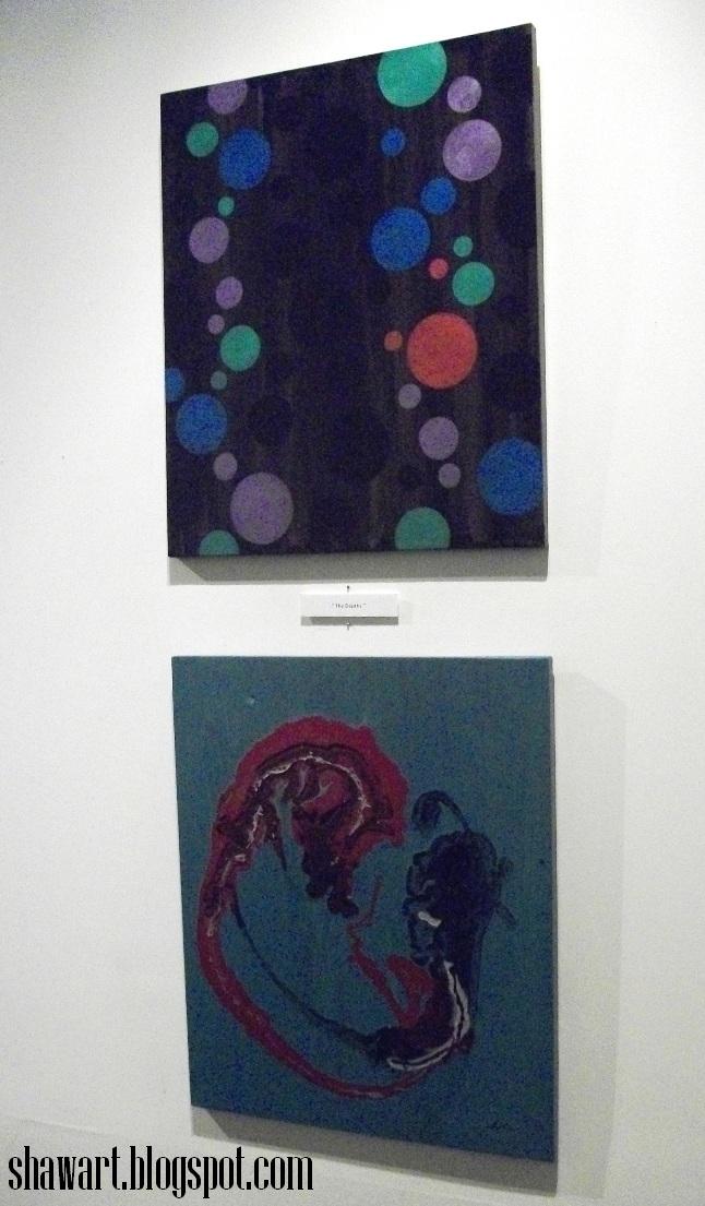
Exhibit B:

"The Depths"
20 x 24" each

Even with my terrible photo, it's easy to see the upward, unfurling movement in these canvases, not to mention the similarity in colors, including the highlight/foreground use of red paint. And though I'm pretty sure Dale wasn't trying to paint a seahorse in his canvas (bottom), but combined with my "bubbly" painting above, there was a sort of quasi-aquatic thing going on here that's undeniable in my eyes. Weird!


Exhibit C:
 "Hot and Cold"
20 x 24" each

Again, the use of red as highlight/foreground color on both of these make them similar, but the silver paint and scratchy, violent nature these two canvases share really drive it home. And though my substandard photo doesn't show it well, my canvas (top) has blueish underpainting revealed where I scratches vertical lines through the silver background. Not unalike!

Exhibit D:
 "Foundation"
20 x 24" each

While this unexplainable, chance "mirroring" of one another goes on throught most all of the show, I offer one of the more enigmatic pairings. There are many ways the two canvases pictured above differ: Dale's canvas (bottom) has a very surface-oriented, topical nature that crosshatches in all directions, whereas my washed in, vertical "sprouts" are deeply imbedded into the red ground color. For no reason Dale could offer, his last touch at the bottom of his canvas was a horizontal line of colors that mirror my canvas above! Why??

And you'd just have to see the rest of them to believe it- nearly every pair baffled both our audience and ourselves with their similarities.  Like something out of the Twilight Zone, this is by far the strangest thing I've ever witnessed or participated in. I've never seen a ghost or UFO, I'm not particularly religious or superstitious, and while the hair wasn't standing on the back of my neck, I'm unsure I'll ever be able to explain what happened here. It was just... surreal. There will be a closing reception on March 30th you won't want to miss if you couldn't make it to the opening- details to come  :)

Friday, February 24, 2012

The Visitor

"The Visitor" 2012
acrylic on canvas, 12 x 24"

We needed a final piece of the puzzle, so to speak, for the Dueling Minds show tonight. So on Wednesday night I whipped out this surreal-looking espresso-bean-invader-from-Mars thing that I just can't explain, LOL! It started off as simple, flat colors and shapes, and then got freakier as the evening got later  :D  This canvas will be featured in the room adjoining the main show, along with more of Dale and my individual works. Dale & I did a final walk-through with Bryan last night, and seeing all the paintings hung on the white walls under the gallery lights was really something- even better than I expected. Dale exceeded my expectations, and it was uncanny how so many of the pairings went together so well when put side by side. As I explained before, we chose titles to be painted on the same sized canvases, and went off separately to make the work. Seeing them together as we lined them along the floor last Sunday, it was bizarre how similar some of them were in color, shape, texture, or all three. So much fun! Come down to Concrete Ocean for the show tonight- Dale, Bryan, and I look forward to meeting you there    :)


DUELING MINDS: COLIN SHAW AND DALE WILKE
Opening Reception: Friday, Feb. 24th 2012 7:00 PM - 11:00 PM
Concrete Ocean Art Gallery
2257 S. Jefferson Avenue, at Shenandoah
Saint Louis, MO 63104
concreteoceanart.com
(314) 448-1796
(314) 497-0199

Thursday, February 23, 2012

Alone In Love

"Alone In Love"
11 x 14"
acrylic on masonite
Feb. 2012

My pal said the other night that my art looks like Tarot card art, the symbols and figures bearing  deep emotional association. She'd probably say the board I painted late Monday night, "Alone In Love" (above), is a prime example. This one won't fit in with my work at the Dueling Minds show at Concrete Ocean this Friday night, but on a high from making so much work recently, I've had so many ideas I need to get out.  I did something here with the green that I had never done before and that's kinda fun.

From Wikipedia:
Carl Jung was the first psychoanalyst to attach importance to tarot symbolism. He may have regarded the tarot cards as representing archetypes: fundamental types of persons or situations embedded in the collective unconscious of all human beings. The theory of archetypes gives rise to several psychoanalytical uses. Since the cards represent these different archetypes within each individual, ideas of the subject's self-perception can be gained by asking them to select a card that they 'identify with'. Equally, the subject can try to clarify the situation by imagining it in terms of the archetypal ideas associated with each card. For instance, someone rushing in heedlessly like the Knight of Swords, or blindly keeping the world at bay like the Rider-Waite-Smith Two of Swords.

See more of my available works at my WORKS AVAILABLE page at Shawart.com :)
email me if you are interested!

Monday, February 20, 2012

Ready, Set... Go


"Magic"  2011
acrylic on canvas, 24 x 30"

Yesterday I delivered my 22 paintings for this Friday's show at Concrete Ocean, as did my show partner, artist Dale Wilke. I was really pleased with how well everything went together, and along with gallery owner Bryan Pease, we arranged how everything will be hung. Today one of the new canvases , "Magic" sold a week before the show- this is usually a good sign of how things will go. It should be a nice crowd Friday night, and Dale, Bryan, and I look forward to meeting you there at Concrete Ocean    :)

DUELING MINDS: COLIN SHAW AND DALE WILKE
Opening Reception:Friday, Feb. 24th 2012 7:00 PM - 11:00 PM
Concrete Ocean Art Gallery
2257 S. Jefferson Avenue, at Shenandoah
Saint Louis, MO 63104
concreteoceanart.com
(314) 448-1796
(314) 497-0199

Saturday, February 4, 2012

Show Postcards!


My show partner Dale ordered the cards he had designed, which should arrive Monday. I've never been one to have these made for shows, feeling their impact is dubious at best these days, social media dominating attention for events here in the 21st century. Dale felt we could get some use out of them, so I went along with it for the novelty of experience, and I liked how the design turned out.


Each of our versions of "The Divide" are featured on the verso, so it's a sneak peek at what the work looks like. That said, many of the 22 canvases I've been working on since last June look wildly different from one another, and their non-objective nature radically "cool" in comparison to my emotionally charged work of the past. Like the press release in my last post stated, I opted to paint completely abstract images for this show, as is Dale's style, to establish some unity. Also important however, was the need to challenge myself to something I'd never done- how would I approach the predetermined titles without using the loaded images, personal symbolism, & narrative style I was accustomed to working in? It wasn't easy!

Left intact with each canvas, however, were my expectations of what I deem a finished, presentable work of art- a complex & difficult to explain system of characteristics, based mostly on aesthetic taste I'm sure, but also presentation. I just knew when I was finished with each one, save a couple that became overworked & had to be redone. Many of them appear rather simple, but required several layers of work to satisfy the demands of my personal vision. One of my friends said they looks as though someone else painted them, which pleased me greatly. Some may not appreciate the 180 degree turn in my work, but I was challenged and invigorated by the experience and I hope the audience will feel the same upon viewing them.

"The Divide"
acrylic on canvas, 20 x 24"

Dueling Minds: Colin Shaw & Dale Wilke
Opening Reception:
Friday, Feb. 24th 2012 7:00PM - 11:00 PM
Concrete Ocean Art Gallery
2257 S. Jefferson Avenue, at Shenandoah
Saint Louis, MO 63104
concreteoceanart.com